
The electromagnetic radiation spectrum includes a very small section that is visible to the human eye. This is known as the “visible light spectrum”. Visible light has varying wavelengths which determine how we see its color.
White light contains all of these wavelengths. Passing white light through a prism separates the light waves across the visible spectrum – simply put, a rainbow of color.
If you remember any one thing from 7th grade science class, it may very well be Roy G. Biv.
This mnemonic device helps us remember the order in which these light rays manifest themselves when white light is passed through the prism: Red, Orange, Yellow, Green, Blue, Indigo and Violet.
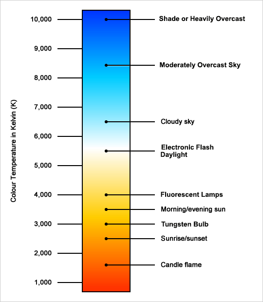
Color temperatures describe the color values throughout the visible spectrum with a numeric value based on the Kelvin Color Temperature Scale. Simply put, color has a numerical value than can be expressed in “degrees Kelvin” or K°.
 White Light
Take another look at Roy G. Biv. If you think about the initials of old Roy, you get R.G.B. (Red, Green, Blue). This is sort of helpful to us to remember that our cameras reproduce colors by adding values of red, green and blue.
If we think about it this way, white light is like the basis for natural color we perceive in daytime sunlight. Daylight is “White Light”. We generally accept that it is measured as 5500 K°. On a camera’s white balance settings, daylight is represented by the “Sun” icon.
The perception of color is the result of light reflecting off of a surface. Under “white light” conditions (5500 K°), color is what we know it to be; a “white” sheet of paper is “white”.
So, what happens when we view color under conditions other than “white light”?
Color Shifts
Understand that every source of light has its own color. These color values range from the very warm tones at 1000K (candlelight) upwards to the very cool tones at 10000K (shade).
Because the perception of color is the result of light reflecting off a surface (or a subject) and because every source of light has its own color, photographers have to be aware of how a light’s color value in K° will impact the recorded color values of a scene.
Remember, 5500K represents daylight (white light). If we have a light source that is measured at 2800K, it is a much “warmer” color of light. In this case, “white” is no longer “white” – it is more orange or yellow. The thing is, our brains trick us. Our brains know that a white sheet of paper is white, so we “see” it as white under almost all lighting conditions. We are simply programmed to see the colors as we know them. We are also fooled by surrounding colors.
A camera, however, does not have a brain to trick it. It simply records the color value of the reflected light coming from the scene. So, when we look at a photograph of a white sheet of paper that has been photographed under a 2800K light source and the camera’s white balance icon set the “the sun”, the paper appears orange or yellow.
For that sheet of paper to appear “white” in the photograph, the photographer would have to recognize that the light source was 2800K and move the white balance setting from the “sun” to the “light bulb” icon which represents “warm” tungsten light A camera that offers a Kelvin option could be set to the “K” setting and then dialed to 2800 in the camera’s white balance menu.
Photographers must deal with color shifts from all artificial light sources and from changes of the sun’s position in the sky or its blockage during cloudy conditions. Remember, color temperatures may range from 1000 to 10000. A camera that offers the Kelvin option for white balance usually covers from 2200K to 10000K in 100° increments. If you add all those up, the Kelvin options provide the photographer with 79 distinctive white balance options.
The white balance icons represent only one of these 79 values for each icon. Since there are only 6 icons that represent a single setting, the camera can only get you “in the ballpark” using these icons. The K setting clearly offers the opportunity for much more accuracy.
What is “Accurate” Color?
The art of photography is subjective. So is color. There are certainly plenty of reasons to record accurate color of any given scene or subject. Accurate color is often a priority for commercial photography. It could also be a priority for a bride who is wearing an off-white dress and desires her images to reflect this subtle hint of warmth to her dress.
There are times, however, when the photographer may wish to impose deliberate shifts to “accurate” color. A photographer may prefer slightly warmer skin tones for example. Perhaps a photographer would prefer slightly “bluer” tones in a snow scene to represent that it is “cold” or overly red tones of a summer scene to emphasize “hot”? These deliberate shifts in color are part of a photographer’s prerogative when it comes to capturing images.